Are you ready to kick your job search into high gear? Your resume is the key to unlocking countless opportunities, but in today’s competitive job market, it’s essential to make it stand out from the crowd. After all, you want to make a lasting impression on potential employers, right? Well, you’re in luck! In this article, we’ll share with you the top design tips to elevate your resume to a whole new level. From choosing a clean and professional layout to incorporating strategic color and visual elements, we’ve got you covered. We’ll also show you how to create balance and clarity with white space, ensure consistency in design, and even provide a handy resource – professional resume templates. So, if you’re ready to make a statement and land your dream job, let’s dive in and transform your resume into a true work of art.
- Key Takeaways
- Choose a Clean and Professional Layout
- Use a Readable Font
- Incorporate Color Strategically
- Highlight Your Key Skills and Achievements
- Include Visual Elements, Such as Icons or Infographics
- Organize Your Content with Headings and Subheadings
- Use White Space to Create Balance and Clarity
- Ensure Consistency in Design Throughout the Resume
- Proofread and Edit for Any Errors or Typos
- Consider Using a Professional Resume Template
- Frequently Asked Questions
- Conclusion
Key Takeaways
- A well-designed resume is crucial in a competitive job market.
- Use headings, subheadings, and bullet points effectively to organize content.
- Strategic use of font, font size, and color can enhance the visual appeal of your resume.
- Tailor your resume to the specific job you are applying for to highlight relevant skills and achievements.
Choose a Clean and Professional Layout
If you want your resume to truly shine, opt for a clean and professional layout that will not only impress employers but also showcase your attention to detail and commitment to professionalism. The layout of your resume plays a crucial role in grabbing the attention of hiring managers and making a lasting impression. To make your resume layout stand out, start by choosing the best resume format that suits your industry and experience level. Consider using a chronological format if you have a strong work history, or a functional format if you want to highlight your skills and achievements. Whichever format you choose, make sure it is visually appealing and easy to navigate.
A clean and professional layout should have clear sections with consistent formatting. Use headings and subheadings to organize your information and make it easy for employers to find what they’re looking for. Incorporate bullet points to highlight key points and make your resume more readable. Remember to leave enough white space to avoid clutter and make your resume visually pleasing.
As you move on to the next section about using a readable font, keep in mind that the font you choose can also contribute to the overall look and feel of your resume.
Planning to Write a Resume?
Check our job winning resume samples


Use a Readable Font
Choose a legible font that captures attention and keeps the reader engaged. When it comes to choosing a font for your resume, readability is key. You want to make sure that the font you choose is easy to read and doesn’t strain the eyes. Avoid using fancy or decorative fonts that may look stylish but sacrifice legibility. Instead, opt for clean and professional fonts such as Arial, Times New Roman, or Calibri. These fonts are widely accepted and are easily readable on both print and digital platforms.
In addition to choosing a readable font, it’s essential to consider the font size. Aim for a font size between 10 and 12 points to ensure that the text is neither too small nor too large. This range strikes a balance between readability and conserving space on your resume. Be consistent with the font size throughout the document to maintain a cohesive and professional appearance.
By using a readable font and appropriate font size, you will enhance the readability of your resume and make it easier for recruiters and hiring managers to review your qualifications. Now that you have a legible foundation, it’s time to move on to the next step: incorporating color strategically.
Incorporate Color Strategically
To add a touch of visual interest, consider strategically incorporating color into your resume. Using color psychology can be an effective way to make a positive impression on potential employers. However, it’s important to use color in a thoughtful and deliberate manner.
Incorporating color in different resume sections can help highlight important information and guide the reader’s attention. For example, you can use color to differentiate headings and subheadings, making them stand out and easy to find. Additionally, using color to highlight your key skills and achievements can make them more memorable to recruiters.
When choosing colors for your resume, it’s crucial to find the right balance. Using too many colors can be overwhelming and distracting, while using too few can make your resume appear dull and uninteresting. Consider using a color palette that complements your personal brand and industry.
Here is an example of an effective color combination for a resume:
| Section | Color |
|---|---|
| Header | Navy Blue |
| Experience | Dark Gray |
| Education | Light Gray |
| Skills | Green |
| Achievements | Gold |
By incorporating color strategically, you can make your resume visually appealing and stand out from the competition. Now, let’s move on to the next section and highlight your key skills and achievements.
Highlight Your Key Skills and Achievements
Now, let’s jazz up your resume by showcasing your impressive skills and noteworthy achievements. When it comes to standing out from the competition, highlighting your key skills and accomplishments is crucial. It’s not enough to simply list your previous job titles and responsibilities; you need to demonstrate the value you brought to those roles.
Start by identifying your most relevant experience and accomplishments. Consider the skills that are most sought after in your industry and make sure to emphasize those. Use specific examples to showcase your achievements, such as exceeding sales targets, leading successful projects, or receiving recognition for your work. Quantify your accomplishments whenever possible, as numbers can have a powerful impact.
In addition to emphasizing relevant experience, it’s also important to tailor your resume to the specific job you’re applying for. Take the time to research the company and the role you’re interested in, and then highlight the skills and achievements that align with their needs.
By showcasing your accomplishments and emphasizing your relevant experience, you’ll make a strong impression on potential employers. In the next section, we’ll explore how to include visual elements, such as icons or infographics, to further enhance your resume’s design.
Include Visual Elements, Such as Icons or Infographics
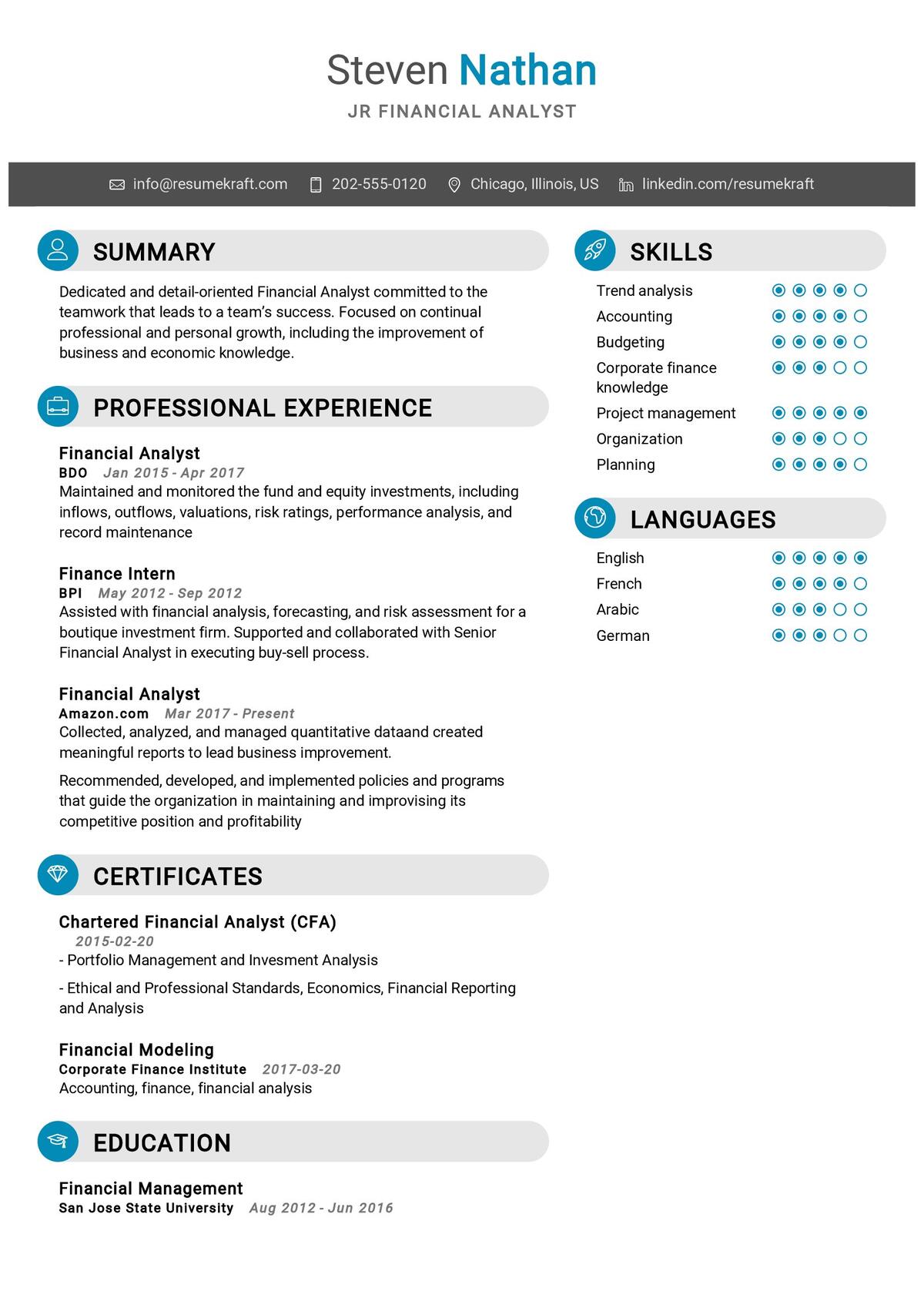
Enhance your resume’s visual appeal and make it more memorable by incorporating eye-catching icons or infographics that will capture the attention of potential employers. Using visuals in your resume can be a powerful way to stand out from the competition and showcase your creativity. However, it is important to weigh the pros and cons before deciding to include visual elements.
Pros of using visuals in your resume:
- Visual elements can grab attention: Icons or infographics can instantly draw the reader’s eye and make your resume stand out in a sea of text.
- Showcasing your skills visually: Visual elements can help you highlight your key skills and achievements in a more visually appealing and engaging way.
- Reflecting your personality: By incorporating visuals that align with your personal brand, you can showcase your unique style and personality to potential employers.
When choosing the right icons for your resume, consider the following:
- Relevance: Ensure that the icons you choose are relevant to the information you are trying to convey.
- Consistency: Stick to a consistent style and color scheme throughout your resume to maintain a professional look.
- Clarity: Choose icons that are easy to understand and won’t confuse the reader.
After incorporating eye-catching visuals, the next step is to organize your content with headings and subheadings to make it easy for employers to navigate through your resume seamlessly.
Organize Your Content with Headings and Subheadings
One way to effectively organize your resume is by using headings and subheadings to create a clear and visually appealing structure. This not only helps the reader navigate through your resume easily but also adds a professional touch to your overall presentation. By categorizing different sections of your resume, such as education, work experience, and skills, you can highlight key information and make it stand out.
When using headings and subheadings, it is crucial to use bullet points to effectively showcase your work experience. Bullet points allow you to present your accomplishments and responsibilities in a concise and readable format. Use action verbs and quantify your achievements to demonstrate the value you can bring to a potential employer.
To create a rhythm and flow in your resume, consider using a 2 column and 3 row table to organize your skills or qualifications. This format not only adds visual interest but also makes it easier for hiring managers to quickly scan and assess your capabilities.
In addition to using headings and subheadings, another important aspect of resume design is the use of white space to create balance and clarity. By strategically incorporating white space around your headings and sections, you can enhance readability and ensure that your resume is visually appealing.
Use White Space to Create Balance and Clarity
Now that you have organized your resume content with headings and subheadings, it’s time to focus on creating visual interest and ensuring clarity through the strategic use of white space. White space refers to the empty areas on your resume that separate different sections and elements. Incorporating white space effectively can enhance readability, draw attention to key information, and create a sense of balance.
By allowing your content to breathe and giving it room to stand out, you can make a strong visual impact on the reader. Use ample white space around headings and subheadings to make them stand out and guide the reader’s eye. Additionally, consider using bullet points or short paragraphs with sufficient spacing between them to make your resume easy to scan.
Remember, cluttered resumes can be overwhelming and difficult to navigate, so be mindful of the amount of information you include and the spacing you use. Strive for a clean, organized look that showcases your skills and experiences effectively.
Now that you understand the importance of white space in creating visual interest and clarity, it’s time to ensure consistency in design throughout your resume.
Ensure Consistency in Design Throughout the Resume
To maintain a cohesive and professional appearance, it’s crucial to establish a consistent design scheme across all sections of your resume. This not only enhances the visual coherence but also creates a cohesive design that showcases your skills and qualifications effectively. A well-designed resume can make a lasting impression on potential employers and set you apart from other candidates.
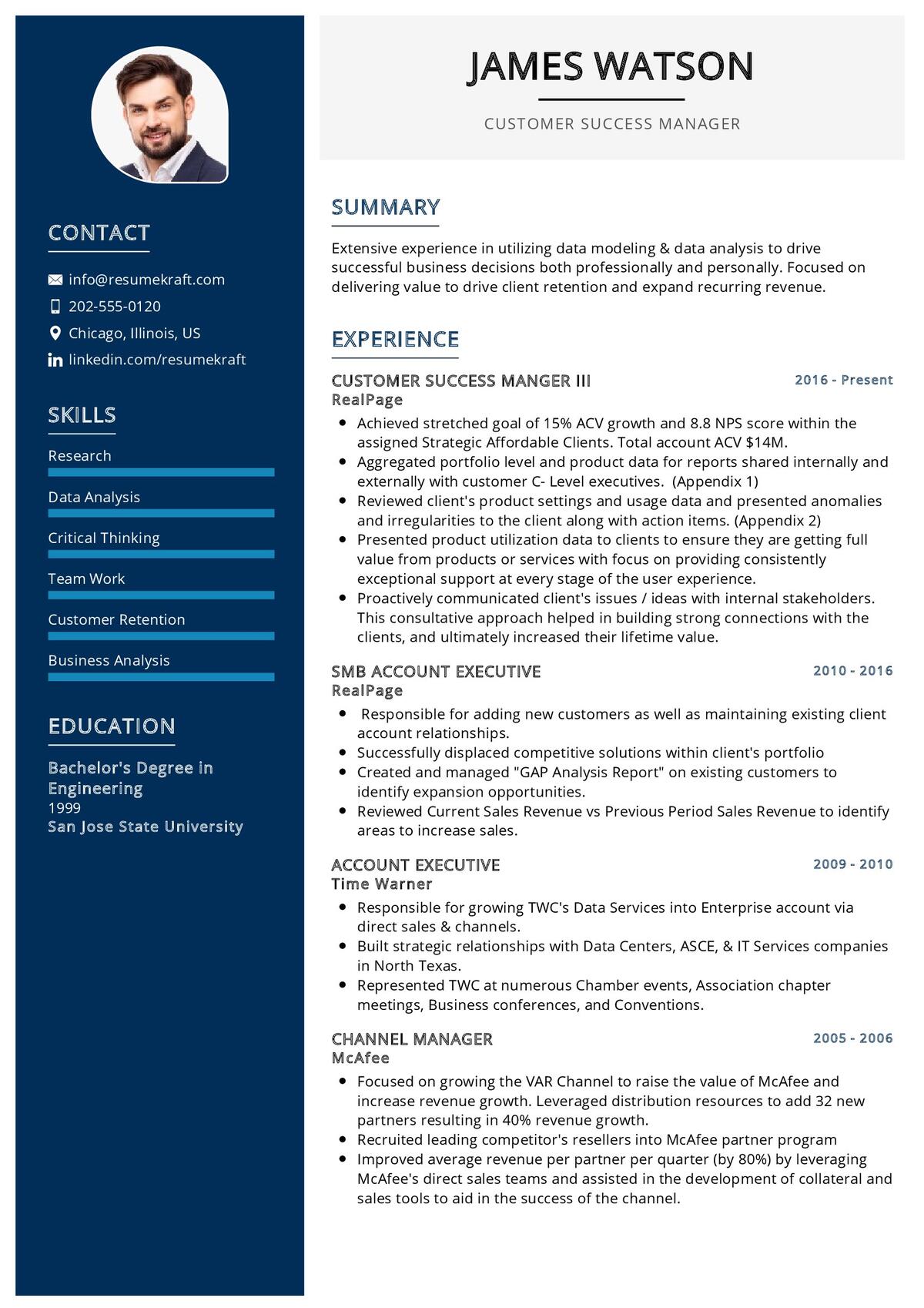
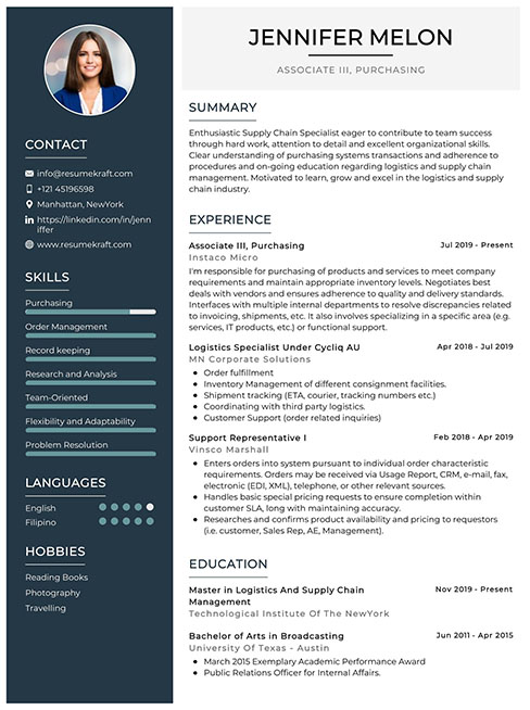
One way to achieve consistency in design throughout your resume is by using a two-column layout. This allows you to organize information in a structured manner, making it easier for recruiters to navigate. For example, you can use the left column to highlight your contact information and skills, while the right column can be used for your work experience and education.
In addition to the layout, you can also maintain consistency by using the same fonts, colors, and formatting throughout your resume. This creates a unified look and ensures that the document appears polished and professional.
To illustrate this concept visually, consider the following table:
| Section | Font | Color | Formatting |
|---|---|---|---|
| Contact | Arial | Black | Bold |
| Skills | Calibri | Blue | Italic |
| Experience | Times New Roman | Black | Regular |
| Education | Helvetica | Gray | Underline |
By following these design principles, your resume will have a consistent and visually appealing look that captures the attention of employers. Now, it’s time to transition to the next section about proofreading and editing for any errors or typos.
Proofread and Edit for Any Errors or Typos
Ensuring consistency in design throughout the resume is crucial for creating a professional and visually appealing document that captures the attention of employers. Here are four proofreading techniques to help you avoid common resume mistakes:
- Read it aloud: Reading your resume out loud can help you catch errors or awkward phrasing that you may not notice when reading silently. This technique can also help you identify any repetitive words or phrases that can be replaced with stronger alternatives.
- Take a break: After you have finished proofreading, take a break and come back to it with fresh eyes. This will help you spot any errors or typos that you may have missed during your initial read-through.
- Use spell-check and grammar-check tools: While these tools are not foolproof, they can help you catch some of the more obvious mistakes. However, it is important to manually review the suggested changes to ensure they make sense in the context of your resume.
- Have someone else review it: Another set of eyes can often catch mistakes that you may have overlooked. Ask a trusted friend, family member, or professional mentor to review your resume for any errors or inconsistencies.
By following these proofreading techniques, you can help ensure that your resume is error-free and effectively communicates your qualifications and experience. Once you have finished proofreading, consider using a professional resume template to further enhance the visual appeal of your document.
Consider Using a Professional Resume Template
Boost your chances of impressing employers by utilizing a professional resume template that will instantly captivate their attention and leave a lasting impression. When it comes to creating a standout resume, the design and layout play a crucial role in grabbing the employer’s attention. Using a professional resume template ensures that your resume has a polished and well-structured appearance, which can make all the difference in a competitive job market.
Professional resume templates are specifically designed to showcase your skills and qualifications in the best possible light. They offer a clean and organized layout that is easy to read and navigate. With a professional resume format, you can highlight your key achievements, job experience, and education in a way that is visually appealing and easy to understand. These templates often include sections for a professional summary, skills, work experience, education, and contact information, making it easier for employers to quickly assess your qualifications.
In addition to providing a visually pleasing layout, professional resume templates also ensure consistency and coherence in your resume. They help you maintain a professional appearance by using appropriate fonts, colors, and formatting styles. This attention to detail reflects positively on your professionalism and attention to detail, which can make a strong impression on potential employers.
By using a professional resume template, you can present your qualifications and achievements in a visually appealing and organized manner. This can help your resume stand out from the competition and increase your chances of landing an interview. Don’t underestimate the power of a well-designed resume layout – it can make all the difference in making a lasting impression on employers.
Frequently Asked Questions
Your resume should be one to two pages long, depending on your level of experience. Use a clean and easy-to-read format that highlights your skills and achievements. Keep it concise and professional to capture the attention of hiring managers.
To customize your resume header, include your name, contact information, and a professional email. Choose a clean and legible font that complements your overall design. This will make a strong first impression on potential employers.
Including a photo of yourself on your resume? Seriously? Unless you’re applying to be a model, it’s best to skip it. Pros: personal touch. Cons: bias, discrimination. Alternatives: focus on skills and experience.
Including references on your resume is not necessary. It is common practice to provide references upon request. Focus on keeping your resume concise and relevant to showcase your skills and qualifications effectively.
To effectively showcase your soft skills on your resume, highlight achievements that demonstrate those skills. Use keywords such as “communication,” “leadership,” and “teamwork” to show employers how you excel in these areas.
Conclusion
After following these design tips, your resume will be like a shining beacon in a sea of blandness. The clean layout and readable font will symbolize your professionalism and attention to detail. Strategic use of color will add a touch of personality and make your resume memorable. Visual elements, like icons or infographics, will bring your achievements to life and make them stand out. The white space will symbolize balance and clarity, ensuring that your information is easy to digest. Finally, using a professional template will symbolize your commitment to excellence. With these techniques, your resume will be a symbol of your unique qualifications and will surely catch the attention of hiring managers.

Build your resume in 5 minutes
Our resume builder is easy to use and will help you create a resume that is ATS-friendly and will stand out from the crowd.
Recommended Reading:

