A resume is a snapshot of your work experience and qualifications that should translate into an interview. It needs to be effective on a recruiter’s screen, and it has to be clear from first sight what you’re offering. A lot goes into making this document perfect, and one small detail can mess up the whole thing. That detail is fonts. Your resume is the first impression that the recruiter has of you, and it’s different for some resumes than others. This article shares 5 fonts that will set you apart from other candidates.
It can be very interesting to see how long the best fonts for your resume will last the test of time, so we’ve collected some examples which may give you clues as to what’s the best today and what will be “Best Fonts for Your Resume” in the near future.
The best fonts for your resume in 2024 should be a mix of conservative and modern. The more conservative you are with the fonts, the more likely it is that your resume will be readable by employers, but if you want to go bolder with your font selections there are some great choices on the market like Calibri Black, Trajan Pro, and Bank Gothic.
Does font matter on a resume?
A common belief is that fonts like Times New Roman or Calibri are so common that they don’t add much to an otherwise rather simple resume. The truth is, the font of your resume does make a difference. This doesn’t mean that if you have the latest version of your favorite Superhero costume you absolutely need to wear it to the interview, but if you’re trying to impress an employer you should consider using one that will help him/her remember who you are.
Times New Roman and its cousins are great for resumes because they’re very legible at small sizes on most screen resolutions (yes, even on mobile devices). They’re easy on the eyes, and they don’t distract the reader from the content.
Calibri is a font that just screams “I’m a 21st-century job seeker” with its curves and angles. It’s smooth and clean on the screen and it’s great for resumes because it looks fancy without being overly flashy. It’s a perfect font for business professionals because it doesn’t scream “I’m looking for my first job in my mom’s basement.”
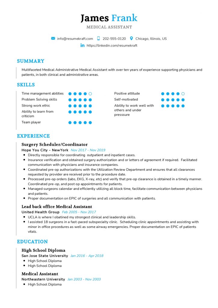
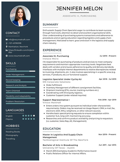
Keep in mind that you shouldn’t use too many different fonts on your resume because your readers won’t know what to think. Your resume should be clean, simple, yet grab the attention of your reader enough to get him/her to call you for an interview.
What should be my font size?
The best font size for your resume will depend on a few factors, namely the type of recruiter you’re applying to and the format in which you’re sending it. For example, job postings that specify a maximum font size will require smaller fonts than other documents. That said if you want to add larger fonts to your resume you can also do this by including an attachment with resized letters (such as “PDF”).
The default font size in Microsoft Word is 11 pt for normal text and 14 pt for heading titles like “Professional Experience”. The recommended sizes vary depending on the profession and the software used but most recruiters will tell you that 8-11 pt is best.
With that in mind, you should keep your font size around 10-11 pt for your resume. You can always add more text later from a PDF file if you want a larger font.
The font size on your resume is important overall, but it also matters for certain headings. When it comes to fonts, the best size you should use will depend on the software you’re using. The most popular software programs have their own built-in font sizes so you should double-check to see what will look best with the program you’re using.
If you’re not sure which font size you should use, it’s a good idea to get a sample of the resumes that are currently working well in the industry. Check out the most popular resume example.
How do you know if your resume will be read?
Your resume can be read by a recruiter or HR person in an instant. If your resume stands out it’s more likely to be read and the recruiter will want to know why!
The best fonts for your resume are those that stand out and are good at conveying your personality or professional style. Using fonts like Helvetica, Lucida, Georgia, and Calibri will help you get noticed if you’re looking for a job as a software engineer, graphic designer, or website developer. You should also look for fonts with subtle highlights to make them easy on the eyes; these fonts have less contrast than bolder ones.
What font is most pleasing to the eye?
In the past few years, almost all employers have opted for serif fonts because they’re easy on the eyes in a professional setting. Serif fonts also resemble old manuscripts and give more structure and style to a document. Arial, Georgia, and Verdana are the three most popular serifs used on resumes.
If you want your resume to stand out you should use serif fonts with lighter weights (like Bookman Light or Cambria) because they’re easier to read at small sizes than older versions.
What is a sans-serif font?
Sans-serif designs are based on straight lines rather than curved strokes like those in Times New Roman or Arial typeface. Sans-serif fonts have become popular in the last few years because they’re easier to read on screens and they fit better in a modern, clean design.
The best sans-serifs for your resume are clean fonts like Helvetica, Avant-Garde, or Verdana. These fonts are very versatile and you can use them on your resume, CV, or cover letter if you want them to stand out.
What should be my font color?
One of the most common errors made by job seekers is using white text on a black background. This is not a good idea because white is very hard for our eyes to focus on (for more information about why this is bad check out this article ).
Instead of white text on a black background, you should use a light-to-medium grey so that the text stands out and doesn’t blend in with the background.
A good rule of thumb is to choose the color opposite of your resume font color. For example, if your resume has a purple font, then you should choose a neutral gray color such as LightGrey or Gray.
It’s always a good idea to test this on a piece of paper first to make sure it’s readable by everyone.
Should I mix fonts on a resume?
Mixing different fonts is a good way to stand out on your resume and show your personality. Just be careful to choose fonts that complement each other and won’t distract the reader from the content.
For example, if you’re just starting out as a graphic designer who loves modern design then you should try using Arial with Helvetica or Bookman Light. As long as you choose a mix of two clean, simple and neutral typefaces, then it will look modern without being overly flashy.
A common way to mix fonts is to use one for the body of your resume (like Bookman) and another for the heading titles (such as Arial Black).
Best font for CV UK
When it comes to your CV, you need to pick a font that looks professional and is easy on the eyes. Your CV will be viewed by lots of people so it needs to look good everywhere.
The same rules for resumes apply to CVs so light-to-medium grey is best and black is an absolute no-no. The most popular serif fonts are Calibri (to match Microsoft Word), Times New Roman (for a traditional look), and Cambria (for a clean, modern feel).
For your CV headlines, you should use a sans-serif font like Arial or Tahoma because they’re easier to read at smaller sizes than serifs like Times New Roman.
Top 12 Best Fonts for Resume in 2021:
- Cambria
- Calibri
- Didot
- Garamond
- Times New Roman
- Helvetica
- Book Antiqua
- Lato
- Trebuchet MS
- Verdana
- Georgia
- Arial

Cambria Font
Cambria is one of the best fonts for your resume because it looks traditional and clean-looking.
Cambria has become one of the most popular typefaces in recent years due to its versatility. You can use it for headings, body text, or logotypes. This font has almost every style you could think of and looks amazing at all sizes!
Calibri Font
Calibri is a clean and modern-looking font perfect for headings on your resume or CV as well as logotypes. This font has a modern style and looks great in all sizes. The italic variation also looks great and is easy to read at smaller sizes.
Didot Font
Didot is one of the most popular serif fonts for resumes because it’s easy on the eyes and easy to read at different sizes.
You can use this font for headings only or for body text as well, but be sure to choose an underline style (see the picture below). This way, your resume will look more professional.
Garamond Font
Garamond is a beautiful typeface that’s perfect for headings and logotypes on your resume. This font is more modern than Times New Roman and will look great at any size. It will also stand out in a pile of dull resumes.
Times New Roman Font
Times New Roman is the traditional typeface of choice for college students and teachers. This font will help your resume look more professional and give it a traditional structure. You should use this font for headings only and not in the body text.
Helvetica Font
Helvetica is one of the most popular sans-serif fonts in the world (and the #1 favorite on resumes across all industries). This font is clean and easy to read at any size.
You can use the underline version (from the picture above) or italic style for your resume headings as well as logotypes. This font looks great at all sizes and will stand out in a sea of dull resumes. You should also try using this font for your cover letter if you’re writing a CV for a job application.
Book Antiqua Font
Book Antiqua is a gorgeous mixture of serif and sans-serif fonts that makes it look very attractive on your resume or CV. This font looks even better on paper than it does in digital form! It has a very formal feel that will make it look really professional.
You can use this font for headings only but should avoid using it in the body text.
Lato Font
Lato is a sans-serif font that looks modern and clean. You can use this font for headings or logotypes on your resume or CV and it will give it a modern twist. This font is perfect for college students, designers, or people who want to look more professional. It’s easy to read at any size and will stand out in the crowd of other resumes.
Trebuchet MS Font
Trebuchet MS is one of the best fonts for any job application. This font has a modern style and gives your resume a fresh, fresh look that’s easy on the eyes.
You can use the italic variation of this font as well as the underline version in your resume or CV. This is a great font that will look great at any size, on paper or digital!
Verdana Font
Verdana is one of the easiest fonts to read on your resume or CV and looks great at all sizes. It has a very clean and modern style that keeps it from looking too boring.
This font is great for heading titles and logotypes but should never be used in the body text. You can use the italic variation instead of underlining your titles on your resume to make it look even better.
Georgia Font
Georgia is a clean-looking serif font that’s perfect for job applications and school resumes. Georgia features slightly rounded letters with a little tail (called a ball terminal) on the lowercase “g.” This makes it easier to read at smaller sizes and helps it stand out from other serif fonts.
It’s best to use Georgia for headings only because it’s not as modern as other serif fonts like Didot.
Arial
Arial is a popular font for resumes because it’s easy to read and looks professional. This font can be used for headings or body text as well. It has a very basic style so it will stand out in the crowd of dull resumes and letters.
Want to write an impressive Resume? so please check our examples of good CV template for your reference. Also, use our free CV builder.
Frequently Asked Questions
There are a few different fonts that are generally considered to be the best fonts for resumes. These include:
1. serif fonts such as Times New Roman or Georgia
2. sans serif fonts such as Arial or Helvetica
3. monospaced fonts such as Courier New
When choosing a font for your resume, it is important to consider readability. The font you choose should be easy to read, both for the person reviewing your resume and for any software that may be scanning it. In addition, you should make sure that the font you choose is appropriate for the tone of your resume. For example, a more playful font may not be the best choice for a resume that is meant to be serious and professional.
Some of the best fonts to use on your resume include Arial, Calibri, and Times New Roman. These fonts are all easy to read, which is important when an employer is reviewing your resume. Additionally, using a serif font (a font with small lines at the end of each stroke) can help to make your resume look more professional.
The best font size for a resume is generally between 10 and 12 points.
Some of the best fonts for a resume in 2024 include:
Arial
Times New Roman
Helvetica
Calibri
Recommended Reading:

